
Oct 13, 2024
Bad Habit
Restaurant
Branding
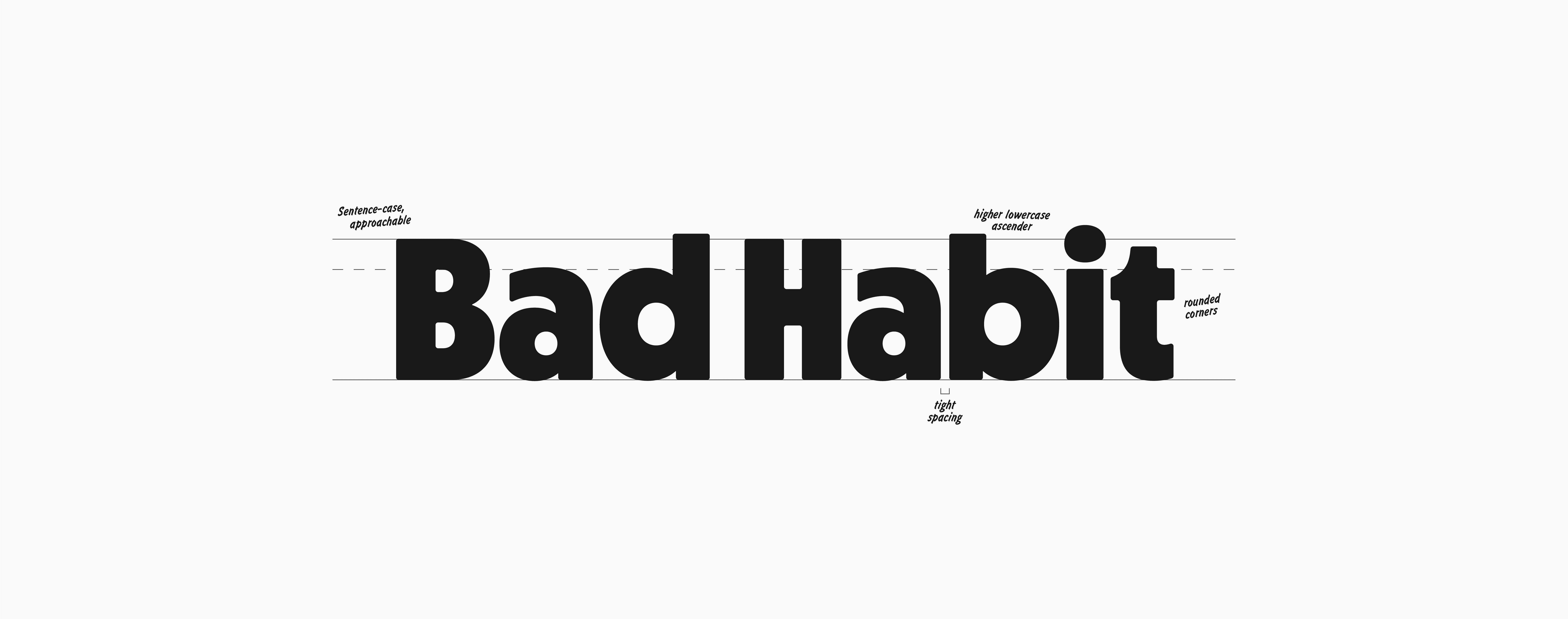
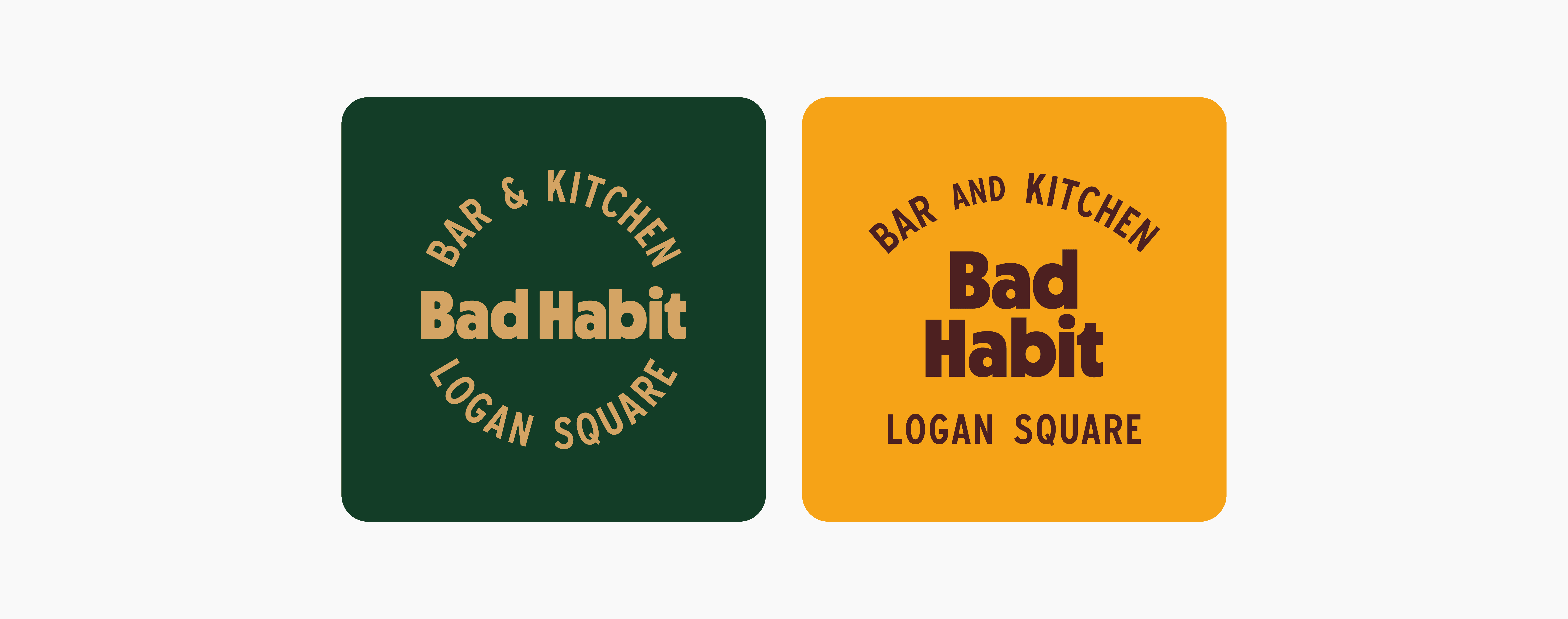
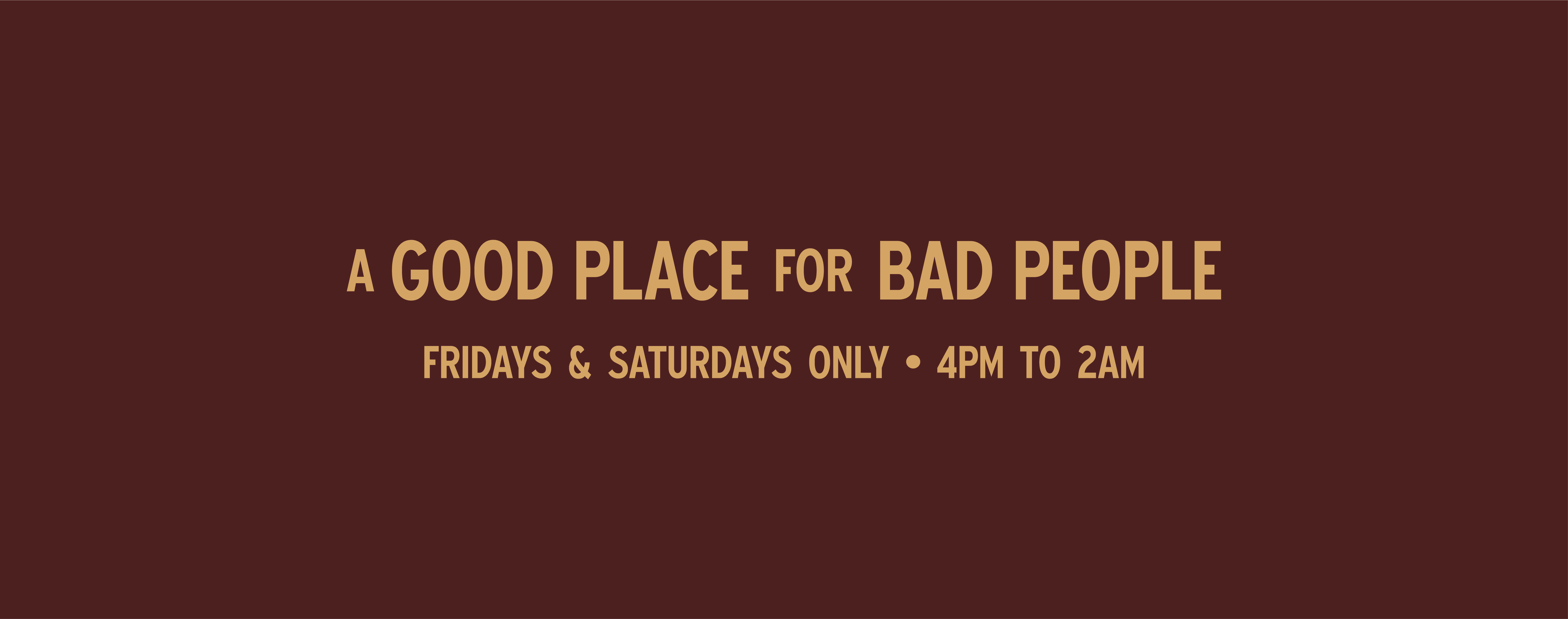
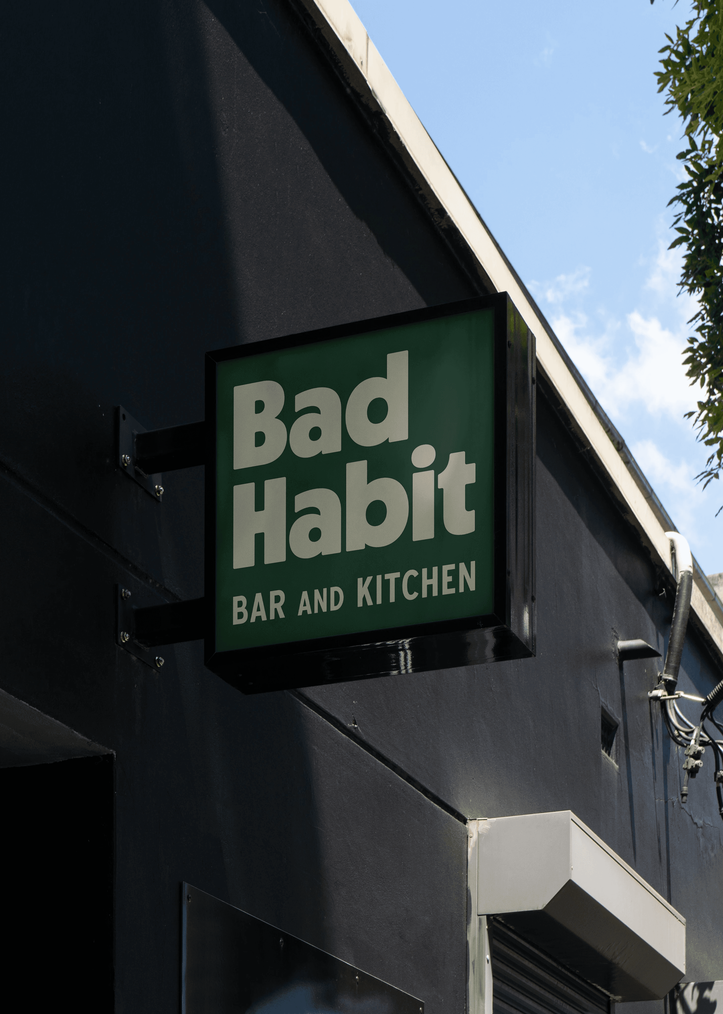
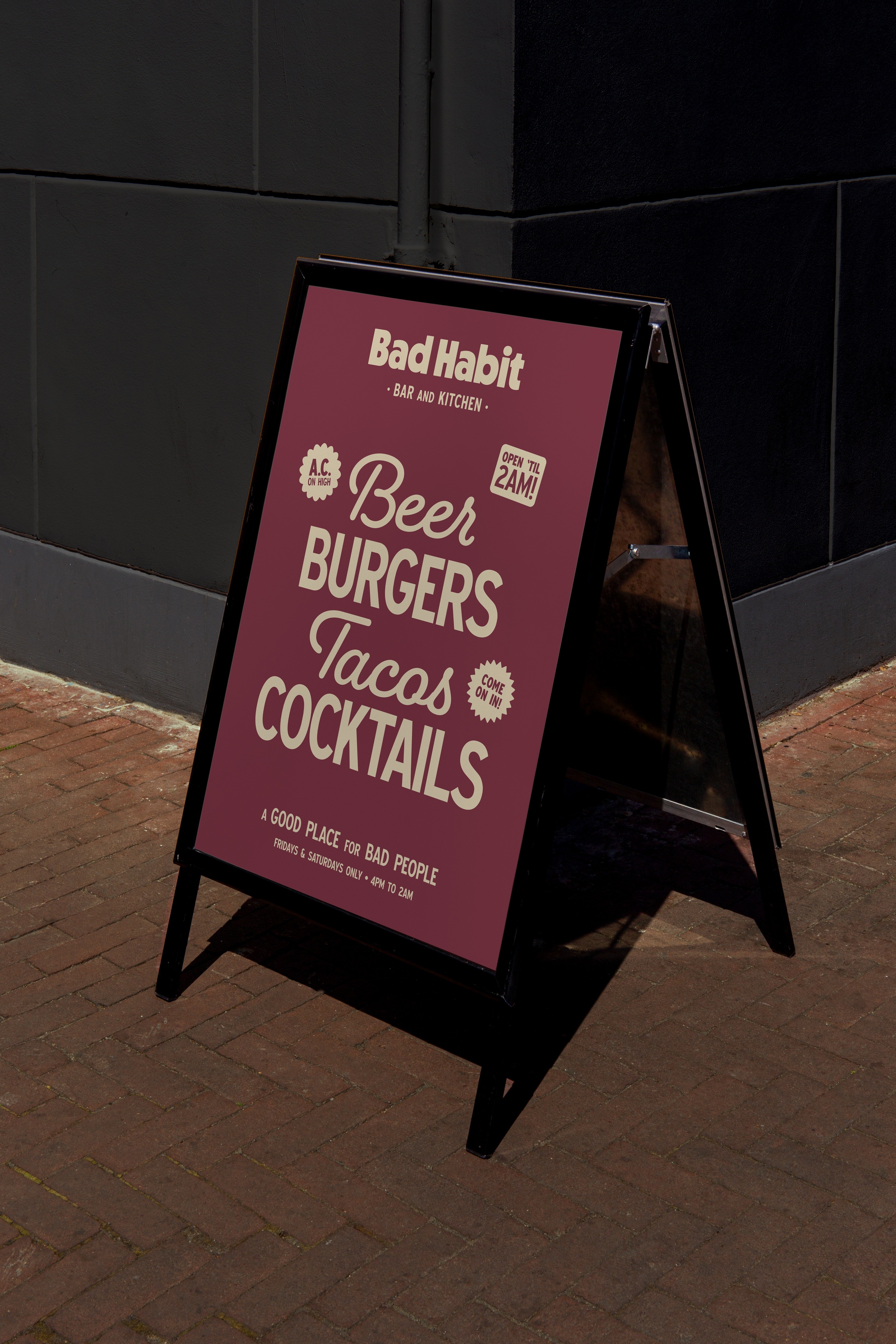
Bad Habit is a bar and restaurant attached to Chicago's Concord Music Hall. Though around for some time, Bad Habit didn't have a cohesive identity that set them apart from the touristy sports bars downtown. Located between Wicker Park and Logan Square, they wanted a brand refresh that reflected the cool energy of the neighborhood but differentiated them from from the trending 'Nashville Chicken Shop' aesthetic. We still chose to go retro, designing the identity to blend a bit of midwestern kitsch with the grit of the city. Leaning into Chicago's dirtbag energy, the tag "a good place for bad people" was born. The classic aesthetic hopes to tap into your memories of basement parties you snuck out to, and well-earned scoldings that were more than worth it. To infuse a bit more locality, the supporting typeface is borrowed from Chicago's Department of Transportation brandkit.
Bad Habit is a bar and restaurant attached to Chicago's Concord Music Hall. Though around for some time, Bad Habit didn't have a cohesive identity that set them apart from the touristy sports bars downtown. Located between Wicker Park and Logan Square, they wanted a brand refresh that reflected the cool energy of the neighborhood but differentiated them from from the trending 'Nashville Chicken Shop' aesthetic. We still chose to go retro, designing the identity to blend a bit of midwestern kitsch with the grit of the city. Leaning into Chicago's dirtbag energy, the tag "a good place for bad people" was born. The classic aesthetic hopes to tap into your memories of basement parties you snuck out to, and well-earned scoldings that were more than worth it. To infuse a bit more locality, the supporting typeface is borrowed from CDOT's brandkit.
Bad Habit is a bar and restaurant attached to Chicago's Concord Music Hall. Though around for some time, Bad Habit didn't have a cohesive identity that set them apart from the touristy sports bars downtown. Located between Wicker Park and Logan Square, they wanted a brand refresh that reflected the cool energy of the neighborhood but differentiated them from from the trending 'Nashville Chicken Shop' aesthetic. We still chose to go retro, designing the identity to blend a bit of midwestern kitsch with the grit of the city. Leaning into Chicago's dirtbag energy, the tag "a good place for bad people" was born. The classic aesthetic hopes to tap into your memories of basement parties you snuck out to, and well-earned scoldings that were more than worth it. To infuse a bit more locality, the supporting typeface is borrowed from CDOT's brandkit.

Brand Design

Brand Development


— Instagram Posts
eatbadhabit

eatbadhabit

eatbadhabit


Designed by Becca Smith
Creative Direction by Kieran Hush & Jon Croney
Creative Direction by Kieran Hush & Jon Croney
Creative Direction by Kieran Hush & Jon Croney