

Projects — All
Filter By
Topic
All
Lifestyle
Wellness
Food & Hospitality
Pets
Manufacturing
Beverage
Agency
Apparel
Music
Cannabis & Psychedelics
Services
All
Brand Identity
Brand Development
Packaging
Web Design
Campaign
Illustration
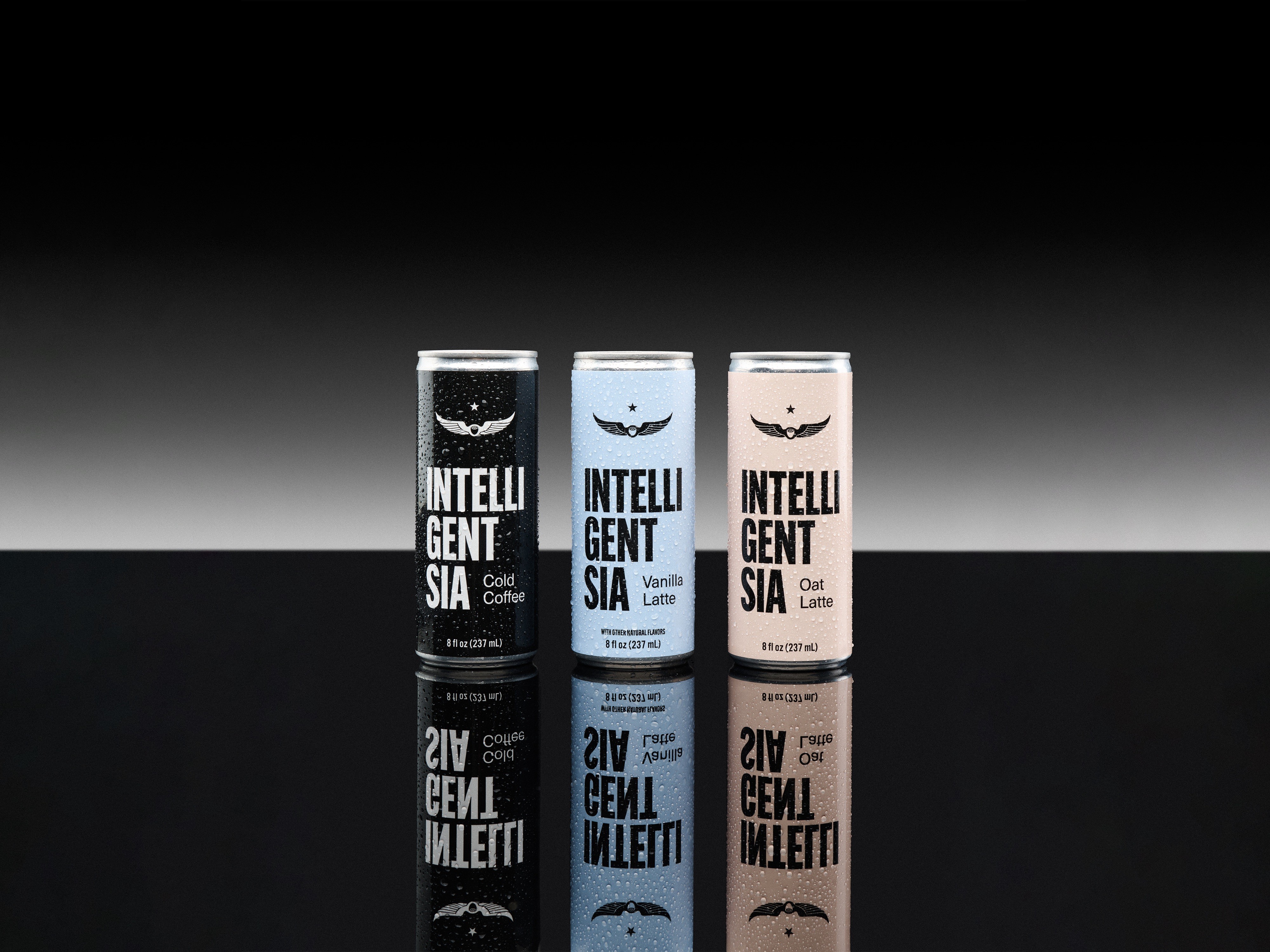
Packaging Design, Coffee
Intelligentsia is a legacy coffee roaster based in Chicago. Their Cold Coffee was already a popular ready-to-drink product line, but the brand wanted to refresh the packaging to appeal to a wider customer base. After a positive debut for our design update on their Oat Lattes, we gained some freedom to play with their branding and create an alternative logo for the can. Their Cold Coffee is brewed hot and flash chilled, and we wanted the new packaging to show Intelligentsia with an edge. Something that understands a quick lifestyle, keeps it simple, and sets itself aside from the go-to canned coffees that it competes with at stores like Whole Foods or Jewel. To roll out the new line, we created a campaign that leaned into the legacy side of their brand through an homage to vintage advertising. Commercials that feel like half-remembered dreams from childhood, and print ads that look like they've been ripped from a magazine in the 60s.
Since launching, Intelligentsia has adopted the refreshed logo treatment to their Signature Blend packaging and staff merchandise and store design — most prominently featured in their new Seoul café (we're huge in Korea).

House Music, Apparel
Celebrating Chicago as the birth place of House Music, ARC brings the global scene back home to it's origins once every August. We collaborated with them to create a collection of merchandise inspired by the vintage rave scene, channeling Y2K motifs and 00s interpretations of techno. We were able to redo their logo, and chose to simplify it in order to have a lot of freedom with the graphic treatments.
Pet Health & Wellness
By combining veterinary research with human-grade wellness, Dog is Human has raised the standard of pet health. While they were still developing their brand in 2022, we were hired to create a logo and packaging for their Multivitamin that reflected their commitment to dog health and wellness.
Given the in-depth research backing their brand, we knew it was important to invoke the feeling of human, innovative science within their identity. With that in mind, the product was targeting millennials who see their dog as family, and it needed to feel balanced — premium but not intimidating.
To reach our target, we took inspiration from modern supplement packaging and added playful notes, like the subtle "tail" at the end of their logo. We chose a dark amber bottle as a nod to supplements (and a genuine utility), but contrasted it with a soft light blue and contemporary fonts to make it trustworthy while still being youthful.
Dog is Human has had great success since launching, making a noticeable mark in pet health. 'Human-Grade' has since become a sought after benefit and much more available on the market.
Since launching their Multivitamin, we also helped design the packaging for their second official release — Multiflex, a powder topper for advanced hip & joint support.
Following the rules of our original packaging system, we were able to expand the visual identity across an additional SKU, utilizing a different color scheme but the same familiar application.

Hospitality, Apparel
Stock was founded in 2012 as a heritage fashion brand, manufactured entirely in Chicago. After building a strong cult following, they were asked to create a custom uniform for the staff at Alinea, a world renowned restaurant. They grew to be an indispensable partner to some of the greatest hospitality establishments in the world and needed an updated branding to match. Taking inspiration from contemporary fashion and vintage Italian design, we created a recognizable, scalable brand identity to set them aside from run-of-the-mill uniform suppliers.

Vintage Apparel
Denim Doctors had existed for over 30 years without a formal identity—built instead on reputation, word of mouth, and an obsessive dedication. Founded by Zip Stevenson in 1994 out of a love for vintage denim and repair, the shop has since become a global destination. Our goal was not to renew Denim Doctors, but to reveal what had always been there. Drawing from the language of vintage Americana, medical iconography, and the subtle authority of long-gone clothing brands, we developed a system that feels both inevitable and classic.

Manufacturing, Textiles
The visual identity of Hyperbola is built on clarity and precision. Every element follows a disciplined grid system, creating order across all formats. This structure allows information to be presented with balance and proportion, whether in small-scale applications or large environments. By adhering to these standards, the identity communicates reliability, professionalism, and timeless design.

Packaging Design, Coffee
Intelligentsia is a legacy coffee roaster based in Chicago, IL. Their Oat Lattes were a popular ready-to-drink product line, but they wanted to update their packaging to appeal to a wider customer base. We chose to emphasize Intelligentsia's reputation with a classic layout loosely based on typographic treatments of 60s brand stamps with soft but unique colors. Prominently featuring their Black Cat and Wing logos, I used Intelligentsia's existing branding to design new packaging that felt fresh and modern while still honoring their brand standards.

Wellness & Beverage
Fuelmate Liquid Collagen Protein Shots are convenient, pre-portioned shots designed for people with active lifestyles. Made for on-the-go consumption, we wanted the branding for Fuelmate to clearly communicate its message in a highly marketable way. Taking inspiration from classic Nike campaigns and 1980s Olympics, we fused the spirit of retro athleisure with vibrant primary colors, giving Fuelmate a timeless brand that fits right in with their customer's lifestyle.

Hospitality, Podcast
Joiners is a podcast hosted by Tim Tierney and Danny Shapiro. They take listeners on a casual stroll through the world of hospitality by chatting with its most colorful characters. The name "Joiners" derives from restaurant industry jargon, referring to a person who joins a table where others are already eating or drinking. We sifted through vintage restaurant ephemera like matchbooks, menus, and napkins to create an identity reminiscent of 1930s Chicago steak-houses and cocktail bars. We included a collection of illustrations to use throughout their branding and for alternate segments, like Taste Test.

Turkey & Ham Gifting
Loewy Foods is a family business that helps companies, organizations, and nonprofits buy turkeys and hams in bulk without the headache. As Loewy Foods transitioned into its fifth generation of family ownership, they were facing a unique problem. Despite being in business for over 100 years, Loewy didn't have a visual Brand Identity. The logo they were using was licensed from Chef's Pride, a partner in Detroit (who still uses it), and the gourmet chef didn't accurately represent the new generation of owners. As I got to know Alex and Judd, I saw them as the type of guys who were willing to run into the burning building of logistics and put out the fires just as much as they were the guys you want to grab a beer with after work. Since they interact with their customer constantly, I knew it was important that the new branding reflected their personality just as much as it did the legacy of the brand.
For inspiration, we dug through their family archive and unearthed photos of Loewenstein memorabilia a century old (like the rusted poultry trailer). I traced the letters and repurposed an old tagline — 'House of Proven Quality' — to honor the history of the business while updating the application to speak to a contemporary audience.
We launched Loewy's branding with a new website, built by Becca on Framer.
Check it out here!

Skincare, Wellness
Onekind is a natural skin care company promoting organic ingredients and honesty. Their clientele demographic ranges heavily across the board, so we collaborated to make thoughtful product lines and an icon system that transcends age groups and clearly communicates the many benefits of each SKU, including their Radical Repair™ and Drops Collections.

Alcohol, Cider
Bringing premium British Isles cider stateside, Shoreline set out to elevate the perception of cider in their home market - Southern California. We created a brand identity and packaging system that blends the visual language of traditional cider and quintessential California beaches.

Modeling & Acting Agency
Option Agency is a premier modeling and acting agency based in New York, Portland, and now Los Angeles. Ahead of their formal launch in LA, Option asked us to refresh their brand identity. Their previous identity felt dated with abrasive hot-pinks and arbitrary triangle motifs, and didn't appeal to the younger, upcoming talent they wanted to target. We felt it was important to emphasize the scale of Option Agency and use the visual identity to solidify their place in the industry. Because they had previously rebranded in 2020, we wanted to make sure they had something that would still feel relevant in 5 or 10 years. To do so, I designed two fully custom logotypes — one that was grounded in something more classic (and a bit Italian), and one that remixed the original with organic curves to add flexibility to the brand. We focused on harmonious, organic colors that stood out, and softened it up with pops of light pink and playful supporting fonts. True contemporary classic.

Psilocybin, Psychedelics
Good Habits is a first-of-its-kind, medicinal magic mushrooms company that is setting the standards for legal psilocybin consumption. They developed an innovative product line of micro, mid, and macro-dosed edibles to promote the therapeutic benefits of regular psilocybin usage in people of all ages and genders and needed a visual identity to match. Knowing we had to appeal to a diverse community, we chose to pay our respects to the 1970s Psychedelic Movement by imagining what legal psychedelic branding would look like in that era. Using a playful, nostalgic tone, we positioned Good Habits as your "older sister" — a safe space, but someone you can have fun growing with. Despite the lightheartedness of product names like "Not Your Grandma's Hard Candy", we were serious about communicating dosage instructions and recommended use on our packaging. We carried this out into social media, doing extensive research on therapeutic psychedelic usage throughout history to share with our online community in engaging ways, like our "Field Guide to Microdosing" (which you can see below). In doing so, we cultivated a strong community exploring the use of psychedelics in individual and collective transformation.

Production Agency
Bodey + Co is a strategy, creative, and full-service production agency redefining storytelling and crafting impactful experiences. Based in New York, LA, and Accra, they wanted an identity that felt globally understood while reflecting the versatility of their big-name clients like MARNI, Jordan, Amazon, or Versace. We created a friendly and approachable identity that could be translated into high-fashion, tech-forward treatments depending on how they wanted to present themselves. Restricting the identity to basic primary colors, we used the interface of cameras as inspiration for brand marks and layouts. We also ended up creating an entirely different identity for them. Post coming soon.

Hospitality, Gourmet Food
Founded in 1996, Chicago Game & Gourmet is the proud supplier to Chicago's best chefs. With an impressive client list that includes Michelin darlings like Alinea and beloved local shops like Bronzeville Hoagie & Panini Cafe, CGG is widely known to be the source for gourmet meats and kitchen items in Chicago. Despite their reputation, their brand identity was dated, and they came to us in need of an update as they expanded into D2C. We chose to reference the Old Chicago energy to match Peter — CGG's fearless leader — and to emphasize their longevity and experience in the industry. The new branding was received fabulously, and I've stayed with CGG to continue developing their brand and other business endeavors. I also designed & created the CGG website, which you can see here!

Hospitality, Restaurant
Bad Habit is a bar and restaurant attached to Chicago's Concord Music Hall. Though around for some time, Bad Habit didn't have a cohesive identity that set them apart from the touristy sports bars downtown. Located between Wicker Park and Logan Square, they wanted a brand refresh that reflected the cool energy of the neighborhood but differentiated them from from the trending 'Nashville Chicken Shop' aesthetic. We still chose to go retro, designing the identity to blend a bit of midwestern kitsch with the grit of the city. Leaning into Chicago's dirtbag energy, the tag "a good place for bad people" was born. The classic aesthetic hopes to tap into your memories of basement parties you snuck out to, and well-earned scoldings that were more than worth it. To infuse a bit more locality, the supporting typeface is borrowed from Chicago's Department of Transportation brand kit.

Hospitality, Restaurant
Bronzeville Hoagie Panini Cafe
Bringing premium British Isles cider stateside, Shoreline set out to elevate the perception of cider in their home market - Southern California. We created a brand identity and packaging system that blends the visual language of traditional cider and quintessential California beaches.

NBA, Merchandise Collection
Austen AG is a midwest-based streetwear brand that was originally inspired by the collaboration between Grateful Dead and Lithuania for the 1992 Olympics, and the prominence of that merchandise in Austen's home town of Lemont. Though Austen curated a strong identity for the subject of his apparel, he lacked a brand identity to match. We took inspiration from vintage Nike and New Balance marketing and combined it with retro collegiate aesthetics to create a brand that felt highly marketable and modern with a rough, midwestern edge.

Production Agency
In 2020, I collaborated with Medly to cultivate their brand identity as New York City's most trusted delivery service for women and queer people. Together, we updated their logo, redid their packaging to better-suit their customer base, and expanded their brand through marketing, events, social media, and the development of their online ordering service.

Lifestyle & Wellness
Founded by creative visionary Sherrise Marshalleck, Acacia + Mason is a lifestyle brand that evolves and grows with you. Focused on home and inner-core wellness, it was important that Acacia + Mason felt like a space you could enter and be in. Somewhere cozy and luxurious.

Packaging Design, Coffee
Intelligentsia is a legacy coffee roaster based in Chicago, IL. Their Oat Lattes were a popular ready-to-drink product line, but they wanted to update their packaging to appeal to a wider customer base. We chose to emphasize Intelligentsia's reputation with a classic layout loosely based on typographic treatments of 60s brand stamps with soft but unique colors. Prominently featuring their Black Cat and Wing logos, I used Intelligentsia's existing branding to design new packaging that felt fresh and modern while still honoring their brand standards.

Production Agency
Bodey + Co is a strategy, creative, and full-service production agency redefining storytelling and crafting impactful experiences. Based in New York, LA, and Accra, they wanted an identity that felt globally understood while reflecting the versatility of their big-name clients like MARNI, Jordan, Amazon, or Versace. We created a friendly and approachable identity that could be translated into high-fashion, tech-forward treatments depending on how they wanted to present themselves. Restricting the identity to basic primary colors, we used the interface of cameras as inspiration for brand marks and layouts. We also ended up creating an entirely different identity for them. Post coming soon.

Packaging Design, Coffee
Intelligentsia is a legacy coffee roaster based in Chicago, IL. Their Oat Lattes were a popular ready-to-drink product line, but they wanted to update their packaging to appeal to a wider customer base. We chose to emphasize Intelligentsia's reputation with a classic layout loosely based on typographic treatments of 60s brand stamps with soft but unique colors. Prominently featuring their Black Cat and Wing logos, I used Intelligentsia's existing branding to design new packaging that felt fresh and modern while still honoring their brand standards.
Packaging Design, Coffee
Intelligentsia is a legacy coffee roaster based in Chicago, IL. Their Oat Lattes were a popular ready-to-drink product line, but they wanted to update their packaging to appeal to a wider customer base. We chose to emphasize Intelligentsia's reputation with a classic layout loosely based on typographic treatments of 60s brand stamps with soft but unique colors. Prominently featuring their Black Cat and Wing logos, I used Intelligentsia's existing branding to design new packaging that felt fresh and modern while still honoring their brand standards.
